
Introduction
If you are reading this, you are likely trying to build a standard flutter accordion widget or a collapsible menu, and the default ExpansionTile is fighting you every step of the way. You drop the widget into your code expecting a clean, modern UI, but instead, you get unwanted grey divider lines, weird background color shifts when the tile opens, or worse—the tile completely forgets its open/close state the moment you scroll it off the screen.
I completely understand the frustration. In my years of shipping production Flutter applications, I’ve seen countless developers get stuck on this exact issue. It feels like a simple UI requirement should have a simple, out-of-the-box solution. Instead, you find yourself digging through Stack Overflow trying to figure out how to remove a stubborn top border or why your dynamically generated flutter collapsible list keeps collapsing on its own.
This article is written specifically for Flutter developers who are actively stuck trying to make ExpansionTile behave in a real-world, production environment. Whether you are dealing with a design system that demands zero borders, or you need to build an exclusive accordion where opening one tile closes the others, you are in the right place.
As of the latest stable Flutter releases in 2026, the framework has given us better tools to handle these exact problems, but they aren’t always obvious. By the end of this guide, you will understand exactly why ExpansionTile behaves the way it does, how to strip away its ugly defaults, and how to build a rock-solid, production-ready accordion.
What the Problem Is
When developers use the flutter expansiontile widget for the first time, they usually encounter three distinct problems that immediately break their UI/UX requirements:
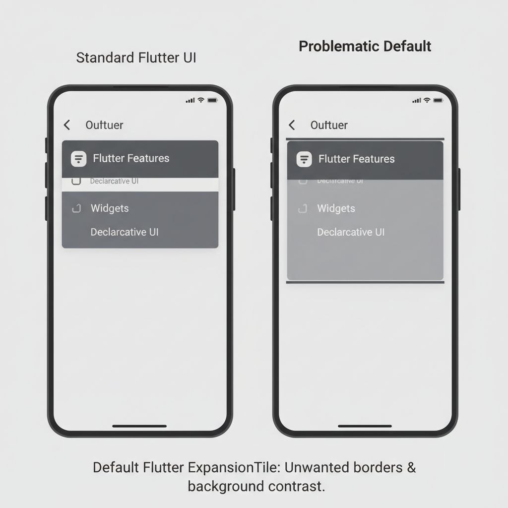
- The Unwanted Borders: By default, Material design injects a 1-pixel top and bottom border (divider) when the tile is expanded. If your app has a custom, card-based design system, these lines look entirely out of place and amateurish.
- The Amnesia Bug (State Loss): When you place multiple
ExpansionTilewidgets inside aListView.builder, scrolling down and back up causes the expanded tiles to snap shut. The widget simply “forgets” that it was open. - The Rogue Background: The background color of the tile shifts slightly upon expansion, which can clash heavily with custom container colors or gradients you’ve applied underneath.
These aren’t necessarily “bugs” in the framework; they are strictly tied to Material Design’s default specifications. However, when you are trying to build a bespoke flutter collapsible list, these defaults become major roadblocks.
Why This Happens (Real Explanation)
To fix these issues permanently, we need to understand what ExpansionTile is actually doing under the hood. It is not just a simple Column with an AnimatedSize widget. It is heavily deeply tied to your app’s ThemeData.
The unwanted borders appear because ExpansionTile is programmed to look for the dividerColor in your theme. When the isExpanded state becomes true, the widget animates the opacity of a top and bottom border. Historically, developers tried to hack this by wrapping the tile in a Theme widget and setting the divider color to transparent. While that works, it’s a messy workaround.
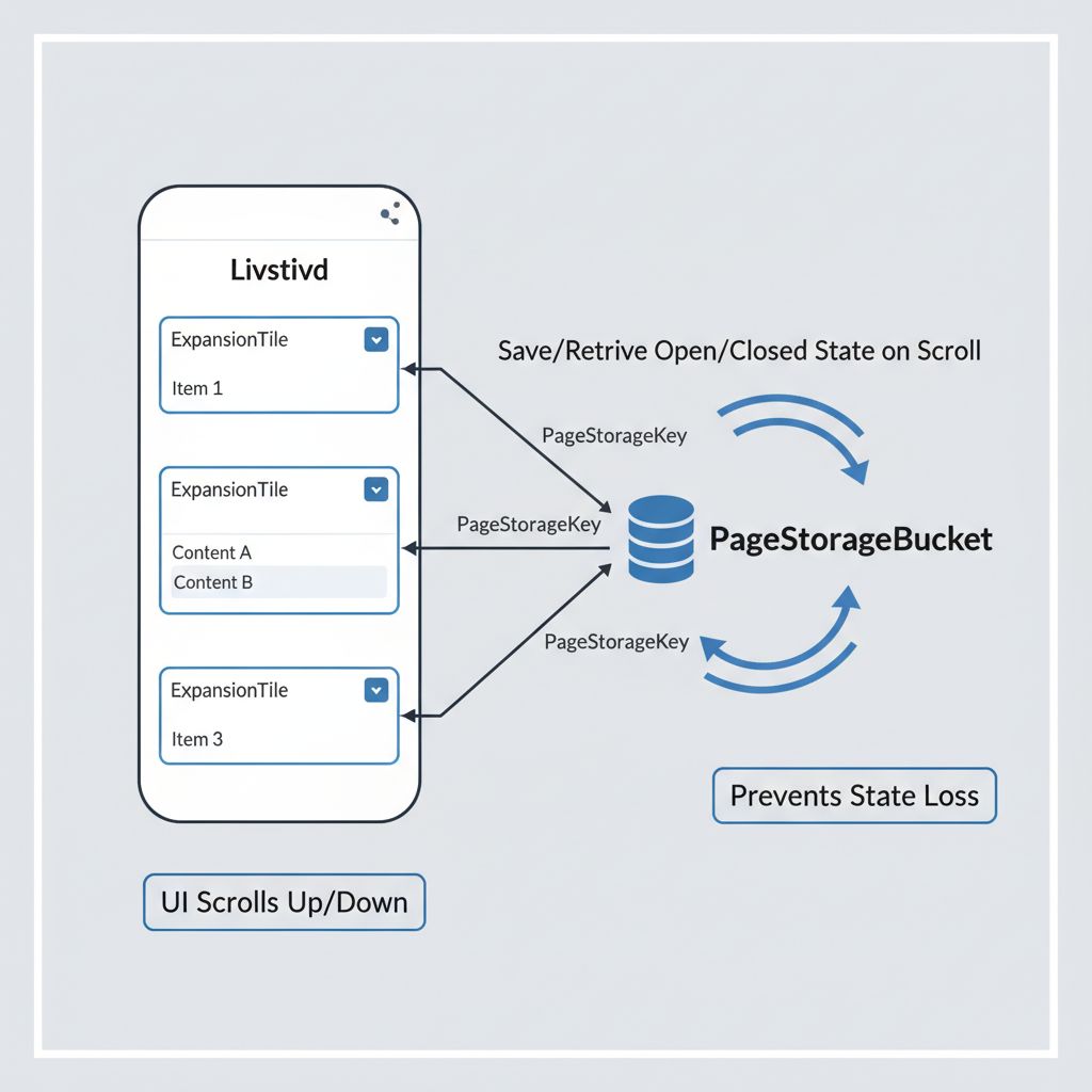
The state loss issue (the “Amnesia Bug”) happens because of how Flutter’s ListView recycles its children. When a widget scrolls out of the viewport, the RenderObject is destroyed to save memory. Because ExpansionTile manages its expanded state internally (as a StatefulWidget), destroying the widget destroys the state. When it scrolls back into view, it initializes from scratch—meaning it defaults to being closed.
Flutter solves this using a PageStorageBucket, which is a mechanism that allows widgets to save their state across rebuilds and scrolling. But ExpansionTile doesn’t know which state belongs to which tile unless you explicitly give it a unique identifier.
When You Usually See This Issue
You will almost certainly run into these roadblocks in the following real-world scenarios:
- FAQ Screens: Building a list of Frequently Asked Questions where the user needs to tap a question to reveal the answer. The designer wants a clean, floating card look, but the default lines ruin it.
- Settings Menus: Creating nested settings where tapping “Account” expands to show “Profile”, “Security”, and “Billing”.
- E-commerce Filters: A sidebar or bottom sheet where users can expand categories like “Size”, “Color”, and “Brand”. State loss here is fatal; if a user scrolls down to “Brand” and scrolls back up, losing their “Size” selections will cause them to abandon the app.
Quick Fix Summary (Decision Shortcut)
If you are in a rush and just need to patch your flutter accordion widget right now, here is the quick fix summary:
- To remove the lines/borders: Set the
shapeandcollapsedShapeproperties of theExpansionTiletoconst Border(). - To stop it from closing when scrolling: Assign a unique
PageStorageKeyto thekeyproperty of yourExpansionTile. - To control it programmatically (open one, close others): Use the ExpansionTileController.
Step-by-Step Solution (Core Section)
Let’s walk through the exact code needed to build a flawless, production-ready flutter collapsible list. We will tackle the UI fixes first, then move on to the state management fixes.
Step 1: Removing the Default Borders and Background Colors
In modern Flutter, we no longer need to use hacky Theme overrides to remove the divider lines. The ExpansionTile widget now exposes shape and collapsedShape properties. By passing an empty Border, we tell the framework to draw absolutely nothing.
import 'package:flutter/material.dart';

class CustomAccordionTile extends StatelessWidget {
  final String title;
  final Widget content;

  const CustomAccordionTile({
    Key? key,
    required this.title,
    required this.content,
  }) : super(key: key);

  @override
  Widget build(BuildContext context) {
    return Card(
      elevation: 0,
      color: Colors.white,
      shape: RoundedRectangleBorder(
        borderRadius: BorderRadius.circular(12),
        side: BorderSide(color: Colors.grey.shade200),
      ),
      child: ExpansionTile(
        // FIX 1: Remove the top/bottom borders when expanded
        shape: const Border(),
        // FIX 2: Remove the top/bottom borders when collapsed
        collapsedShape: const Border(),
        // FIX 3: Prevent background color shift
        backgroundColor: Colors.transparent,
        collapsedBackgroundColor: Colors.transparent,

        title: Text(
          title,
          style: const TextStyle(
            fontWeight: FontWeight.w600,
            color: Colors.black87,
          ),
        ),
        children:[
          Padding(
            padding: const EdgeInsets.all(16.0),
            child: content,
          ),
        ],
      ),
    );
  }
}
Why this works: The shape property defines the outline of the tile when isExpanded is true. By explicitly defining it as const Border() (which has no sides defined), it overrides the default Material divider injection. We wrap it in a Card to give it our own custom, clean border and rounded corners.
Step 2: Fixing the “Amnesia Bug” (Scrolling State Loss)
Now, let’s say you have 50 FAQs. You put our CustomAccordionTile inside a ListView.builder. To ensure the tiles remember if they are open or closed when the user scrolls, we must inject a PageStorageKey.
class FAQScreen extends StatelessWidget {
  final List<Map<String, String>> faqs =[
    {"question": "How do I reset my password?", "answer": "Go to settings..."},
    {"question": "Where is my order?", "answer": "Check the tracking page..."},
    // ... imagine 50 more items here
  ];

  FAQScreen({Key? key}) : super(key: key);

  @override
  Widget build(BuildContext context) {
    return Scaffold(
      appBar: AppBar(title: const Text('FAQs')),
      body: ListView.builder(
        itemCount: faqs.length,
        itemBuilder: (context, index) {
          final faq = faqs[index];
          return Padding(
            padding: const EdgeInsets.symmetric(horizontal: 16.0, vertical: 8.0),
            child: CustomAccordionTile(
              // CRITICAL FIX: The PageStorageKey ensures the expanded state
              // survives the ListView recycling process.
              key: PageStorageKey<String>('faq_${index}'),
              title: faq['question']!,
              content: Text(faq['answer']!),
            ),
          );
        },
      ),
    );
  }
}
When to use this: Always use a PageStorageKey when placing stateful expandable widgets inside any scrollable list (like ListView, SliverList, or GridView). It is cheap, highly performant, and instantly solves the scrolling bug.
Step 3: Building an “Exclusive” Accordion (Only one open at a time)
A very common requirement is an accordion where opening one tile automatically closes the previously opened tile. While Flutter provides ExpansionPanelList for this, it is notoriously rigid and hard to customize. Instead, we can use the modern ExpansionTileController with a standard ListView.
class ExclusiveAccordion extends StatefulWidget {
  @override
  _ExclusiveAccordionState createState() => _ExclusiveAccordionState();
}

class _ExclusiveAccordionState extends State<ExclusiveAccordion> {
  // Store the index of the currently expanded tile
  int? _expandedIndex;

  @override
  Widget build(BuildContext context) {
    return ListView.builder(
      itemCount: 5,
      itemBuilder: (context, index) {
        return ExpansionTile(
          key: Key('exclusive_$index'),
          title: Text('Section $index'),
          // Control the expanded state manually based on our tracking variable
          initiallyExpanded: index == _expandedIndex,
          onExpansionChanged: (bool isExpanded) {
            setState(() {
              if (isExpanded) {
                _expandedIndex = index; // Open this one
              } else {
                _expandedIndex = null; // Close it if tapped again
              }
            });
          },
          children:[
            Container(
              padding: const EdgeInsets.all(16),
              child: Text('Content for section $index'),
            )
          ],
        );
      },
    );
  }
}
Why this works: By lifting the state up to the parent widget (_ExclusiveAccordionState), we track exactly which index is allowed to be open. When a tile is tapped, onExpansionChanged fires, we update the _expandedIndex, and call setState(). The ListView rebuilds, and because we bind initiallyExpanded to our state, the old tile closes and the new one opens.
Note: If you are fetching the content of your expanded tile from an API, you don’t want to show a blank space while it opens. I highly recommend implementing a custom shimmer loading effect inside the children array while the data loads to keep the user engaged.

Common Mistakes Developers Make
Even with the right code, it is easy to shoot yourself in the foot with a flutter expansiontile. Here are the most frequent mistakes I see in code reviews:
- Wrapping ExpansionTile in a fixed-height Container:
ExpansionTileneeds to animate its height from the size of theListTileto the combined size of theListTileplus its children. If you wrap it in aContainer(height: 100), you will get severe “Bottom Overflowed by X pixels” Red Screen of Death errors when it tries to expand. - Forgetting
maintainStatefor heavy children: By default, when a tile collapses, it disposes of its children to save memory. If your children contain Video Players, WebViews, or complex Canvas animations, they will have to cold-boot every time the user opens the tile. If you need them to stay alive in the background, you must setmaintainState: true. - Using
ExpansionPanelListfor simple tasks: Developers often jump toExpansionPanelListbecause they think it’s the only way to get a group of accordions. It requires a lot of boilerplate and forces a specific card-like UI.ExpansionTileis vastly more flexible for 90% of use cases.
Warnings and Practical Tips
⚠️ Warning on maintainState: true: Only use this if absolutely necessary. If you have a list of 100 ExpansionTiles and you set maintainState: true on all of them, your app will keep all 100 sets of children in memory simultaneously. This is a fast track to Out Of Memory (OOM) crashes on older iOS and Android devices.
💡 Customizing the Trailing Icon: You aren’t stuck with the default dropdown arrow. You can use the trailing property to pass any widget. However, if you pass a custom widget, ExpansionTile will not automatically rotate it for you. If you want a custom plus/minus icon that animates, you will need to build a custom StatefulWidget with an AnimationController.
💡 Removing Padding: ExpansionTile has built-in padding inherited from ListTile. If you need the title to sit flush against the edge of the screen, use the tilePadding property and set it to EdgeInsets.zero.
Edge Cases and Limitations
While ExpansionTile is incredibly powerful, it has a few limitations you should be aware of:
Deeply Nested Tiles: If you place an ExpansionTile inside another ExpansionTile, you might experience layout jumping during the expansion animation. This happens because the parent tile is trying to calculate its height while the child tile is simultaneously animating its own height. To mitigate this, ensure your nested data structures are shallow, or consider navigating to a new screen for deeply nested categories rather than using infinite accordions.
Scroll-to-Visible Issues: If you have a very long list of children inside an ExpansionTile, opening it might push the content completely off the bottom of the screen, leaving the user staring at the title and wondering what happened. You often have to manually implement a ScrollController to scroll the screen down when the tile expands, which requires calculating the RenderBox offsets.
What Happens If You Ignore This Problem
Leaving the default ExpansionTile behavior in a production app might seem like a minor cosmetic issue, but it has real consequences for user experience.
First, the state loss bug (Amnesia bug) severely damages user trust. If a user spends time opening specific filters in an e-commerce app, scrolls down to see the results, and scrolls back up only to find their filters visually reset, they will assume the app is broken. This leads to higher bounce rates and uninstalls.
Second, ignoring the styling constraints (the grey lines and background shifts) breaks the visual immersion of your app. If your company spent thousands of dollars on a custom Figma design system, leaving default Material widgets untouched signals a lack of attention to detail to both your clients and your users.
FAQ Section
How do I remove the divider line in an ExpansionTile?
Set both the shape and collapsedShape properties to const Border(). This overrides the default Material theme divider injection completely.
How do I change the background color when expanded?
Use the backgroundColor property for the expanded state, and collapsedBackgroundColor for the closed state. If you want it to remain consistent, set both to the same color (e.g., Colors.white or Colors.transparent).
Can I open an ExpansionTile programmatically from a button?
Yes. You can assign an ExpansionTileController to the controller property of the widget. Then, simply call controller.expand() or controller.collapse() from anywhere in your code.
Why does my ExpansionTile close when I scroll?
Because the ListView destroys the widget to save memory when it leaves the screen. Assign a unique PageStorageKey to the key property of your ExpansionTile to save its state in the framework’s memory bucket.
Final Takeaway & Conclusion
Mastering the flutter expansiontile widget is a rite of passage for every Flutter developer. What starts as a frustrating battle against default Material design borders and scrolling state loss quickly becomes manageable once you understand how the widget hooks into the Theme and the PageStorage systems.
Your Actionable Checklist:
- Always define
shape: const Border()andcollapsedShape: const Border()to take control of your UI. - Never use an expandable widget inside a scrollable view without a
PageStorageKey. - Use a parent state variable or
ExpansionTileControllerto build exclusive, single-open accordions. - Be mindful of memory leaks and avoid using
maintainState: trueunless strictly required by heavy children.
Flutter gives you all the tools you need to build beautiful, highly customized collapsible lists. Update your codebase with the snippets provided above, restart your app, and watch those stubborn grey lines disappear. You’ve got this!