Introduction
If you are trying to build a flutter floating action button menu, you have probably realized it is not as straightforward as the basic Flutter tutorials make it seem. You drop a standard FAB into your Scaffold, but when you need it to expand into a multi-item menu, things get complicated fast.
You might be struggling with a custom Stack where the background doesn’t dim correctly, or maybe your expanded buttons are causing layout overflow errors. Even worse, you might have background widgets stealing tap events through your newly created menu. If you are sitting there staring at a janky animation or a broken layout, take a breath. I have been exactly where you are.
This is an incredibly common hurdle in real-world Flutter development. In production apps—especially productivity tools or social media platforms—users expect a polished, animated speed dial menu. But because Flutter’s default FloatingActionButton is designed to be a single, static button, forcing it to behave like an expandable menu requires specific architectural decisions.
This article is for mid-level to senior Flutter developers who need a reliable, production-ready solution right now. Whether you want to drop in the community-favorite package or build a completely custom flutter fab expand animation from scratch to avoid dependencies, we are going to solve this problem completely today. By the end of this guide, you will have a buttery-smooth, bug-free FAB menu running in your Flutter 3.2x app.
What the Problem Is
When developers first try to build a flutter floating action button menu, they usually wrap their FAB in a Column and use a boolean flag to show or hide extra buttons above it. On the surface, this seems logical.
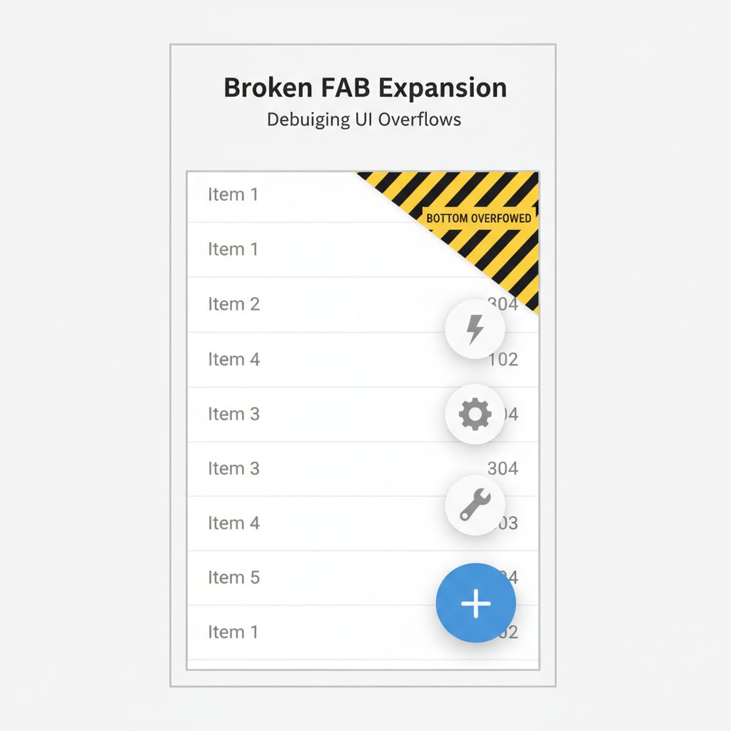
However, the developer experience quickly degrades. The Scaffold’s floatingActionButton slot expects a specific size. When you dynamically change the size of the widget in that slot, it can cause sudden layout shifts. Furthermore, if you want a dark, semi-transparent overlay to cover the rest of the screen when the menu opens, a simple Column inside the FAB slot cannot easily break out to cover the entire screen behind it. You end up with buttons that clip behind other UI elements or fail to register taps.
Why This Happens (Real Explanation)
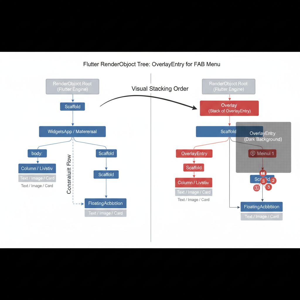
To understand why your custom FAB menu is breaking, we have to look at how Flutter handles layouts and z-indexing. Flutter uses a strict box constraint model. Widgets pass constraints down, and sizes up.
The Scaffold widget isolates the floatingActionButton in its own layer, separate from the body. When you try to expand a menu purely within the FAB slot, it is constrained by the local layout bounds. To make a menu that overlays the entire screen, dims the background, and animates smoothly, you cannot just stack widgets in the FAB slot. You must either utilize the Overlay class to paint above the entire Scaffold, or structure your Scaffold’s body with a global Stack that manages the z-index of the dimming layer and the buttons.
When You Usually See This Issue
You will typically run into this wall when building scalable, real-world applications such as:
- Task Management Apps: Where a single “Add” button needs to expand into “Add Task”, “Add Project”, and “Add Note”.
- Social Media Feeds: Where the primary action button expands to let users choose between posting text, an image, or a video.
- Client Projects with Strict Design Systems: Where designers hand off complex, custom-curved animations for the FAB that standard Flutter widgets cannot handle out of the box.
Quick Fix Summary (Decision Shortcut)
If you are on a tight deadline and just need this fixed in the next five minutes, here is your decision matrix:
- The 90% Solution: Use the flutter speeddial package. It handles the Overlay, background dimming, and animations perfectly out of the box.
- The 10% Solution (Highly Custom): If your design requires a deeply specific flutter fab expand animation (like a radial/circular expansion) or you are strictly avoiding third-party dependencies, build a custom
AnimationControllercombined with anOverlayEntryor a full-screenStack.
Step-by-Step Solution (Core Section)
Let’s cover both the package approach and the custom approach. In my 5+ years of shipping Flutter apps, I’ve used both depending on the project’s constraints.
Approach 1: The Reliable Package (flutter_speed_dial)
For most production apps, reinventing the wheel is a waste of time. The flutter_speed_dial package is the industry standard for this exact problem.
First, add it to your pubspec.yaml:
dependencies:
  flutter:
    sdk: flutter
  flutter_speed_dial: ^7.0.0 # Use the latest version
Here is how to implement it cleanly within your Scaffold:
import 'package:flutter/material.dart';
import 'package:flutter_speed_dial/flutter_speed_dial.dart';

class SpeedDialExample extends StatelessWidget {
  const SpeedDialExample({super.key});

  @override
  Widget build(BuildContext context) {
    return Scaffold(
      appBar: AppBar(title: const Text('Speed Dial Menu')),
      body: const Center(child: Text('Tap the FAB')),
      // The SpeedDial widget replaces the standard FloatingActionButton
      floatingActionButton: SpeedDial(
        icon: Icons.add,
        activeIcon: Icons.close,
        spacing: 12,
        spaceBetweenChildren: 12,
        backgroundColor: Colors.blue,
        foregroundColor: Colors.white,
        activeBackgroundColor: Colors.red,
        elevation: 8.0,
        animationCurve: Curves.elasticInOut,
        isOpenOnStart: false,
        // Dims the background automatically
        renderOverlay: true,
        overlayColor: Colors.black,
        overlayOpacity: 0.5,
        children:[
          SpeedDialChild(
            child: const Icon(Icons.videocam),
            backgroundColor: Colors.green,
            foregroundColor: Colors.white,
            label: 'Video',
            onTap: () => print('Video tapped'),
          ),
          SpeedDialChild(
            child: const Icon(Icons.image),
            backgroundColor: Colors.orange,
            foregroundColor: Colors.white,
            label: 'Image',
            onTap: () => print('Image tapped'),
          ),
        ],
      ),
    );
  }
}
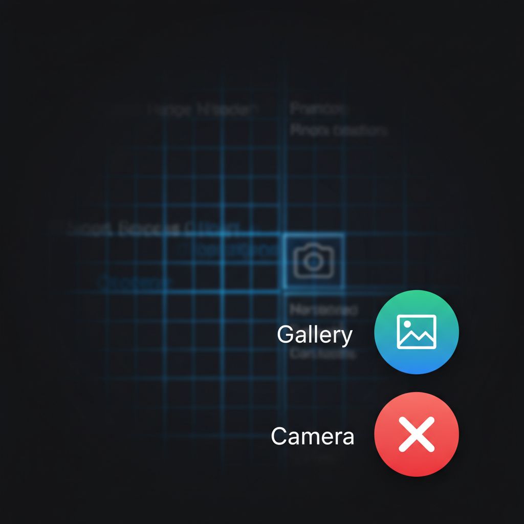
Why this works: The package automatically handles the Overlay insertion. When the menu opens, it inserts a barrier that blocks background taps and dims the UI, while animating the children effortlessly.
Approach 2: The Custom Animation (No Dependencies)
If you cannot use third-party packages, you must build it yourself. The safest way to do this without messing up your Scaffold is to use an AnimationController and manage the state locally. To avoid Overlay complexities, we will use a full-screen Stack.
import 'package:flutter/material.dart';

class CustomFabMenu extends StatefulWidget {
  const CustomFabMenu({super.key});

  @override
  State<CustomFabMenu> createState() => _CustomFabMenuState();
}

class _CustomFabMenuState extends State<CustomFabMenu> with SingleTickerProviderStateMixin {
  late AnimationController _controller;
  late Animation<double> _expandAnimation;
  bool _isOpen = false;

  @override
  void initState() {
    super.initState();
    _controller = AnimationController(
      value: 0.0,
      duration: const Duration(milliseconds: 250),
      vsync: this,
    );
    _expandAnimation = CurvedAnimation(
      curve: Curves.fastOutSlowIn,
      reverseCurve: Curves.easeOutQuad,
      parent: _controller,
    );
  }

  @override
  void dispose() {
    _controller.dispose();
    super.dispose();
  }

  void _toggleMenu() {
    setState(() {
      _isOpen = !_isOpen;
      if (_isOpen) {
        _controller.forward();
      } else {
        _controller.reverse();
      }
    });
  }

  @override
  Widget build(BuildContext context) {
    return Scaffold(
      appBar: AppBar(title: const Text('Custom FAB Menu')),
      body: Stack(
        children:[
          // Main Body Content
          ListView.builder(
            itemCount: 20,
            itemBuilder: (context, index) => ListTile(title: Text('Item $index')),
          ),

          // Background Dimming Overlay
          if (_isOpen)
            GestureDetector(
              onTap: _toggleMenu, // Close menu when tapping outside
              child: AnimatedBuilder(
                animation: _controller,
                builder: (context, child) {
                  return Container(
                    color: Colors.black.withOpacity(_controller.value * 0.5),
                  );
                },
              ),
            ),
        ],
      ),
      floatingActionButton: Column(
        mainAxisSize: MainAxisSize.min,
        crossAxisAlignment: CrossAxisAlignment.end,
        children:[
          // Animated Child 2
          _buildAnimatedItem(
            icon: Icons.camera_alt,
            label: 'Camera',
            index: 2,
          ),
          const SizedBox(height: 16),
          // Animated Child 1
          _buildAnimatedItem(
            icon: Icons.photo,
            label: 'Gallery',
            index: 1,
          ),
          const SizedBox(height: 16),
          // Main FAB
          FloatingActionButton(
            onPressed: _toggleMenu,
            child: AnimatedIcon(
              icon: AnimatedIcons.menu_close,
              progress: _expandAnimation,
            ),
          ),
        ],
      ),
    );
  }

  Widget _buildAnimatedItem({required IconData icon, required String label, required int index}) {
    return SizeTransition(
      sizeFactor: _expandAnimation,
      axisAlignment: -1.0,
      child: FadeTransition(
        opacity: _expandAnimation,
        child: Row(
          mainAxisSize: MainAxisSize.min,
          children:[
            Container(
              padding: const EdgeInsets.symmetric(horizontal: 12, vertical: 6),
              decoration: BoxDecoration(
                color: Colors.white,
                borderRadius: BorderRadius.circular(8),
                boxShadow: const[BoxShadow(color: Colors.black26, blurRadius: 4)],
              ),
              child: Text(label, style: const TextStyle(fontWeight: FontWeight.bold)),
            ),
            const SizedBox(width: 16),
            FloatingActionButton.small(
              heroTag: 'fab_$index', // CRITICAL: Prevent hero tag conflicts
              onPressed: () {
                _toggleMenu();
                print('$label tapped');
              },
              child: Icon(icon),
            ),
          ],
        ),
      ),
    );
  }
}
When to use this: Use this custom approach when you need absolute control over the widget tree, or when you are implementing a highly bespoke design that standard packages cannot accommodate.
Common Mistakes Developers Make
Over the years, I have seen developers (and myself) make the same mistakes when building a flutter floating action button menu. Avoid these at all costs:
- Forgetting to dispose the AnimationController: This is a classic memory leak. Always call
_controller.dispose()in yourState‘sdisposemethod. - Duplicate Hero Tags: If you use multiple
FloatingActionButtonwidgets on the same screen (like in our custom example), Flutter will throw an error about duplicate Hero tags. You must assign a unique string to theheroTagproperty of every child FAB. - Placing the FAB inside a scrollable view: Sometimes developers try to put the FAB inside their
ListVieworCustomScrollView. This causes the FAB to scroll off the screen. Keep it in the Scaffold’sfloatingActionButtonproperty. If you are struggling with complex scrollable layouts and headers, I highly recommend reading our guide on Mastering Flutter SliverAppBar: Fix Layout Errors & Smooth Headers to get your layout architecture right.
Warnings and Practical Tips
⚠️ Hardware Back Button: In Android, users expect the physical back button (or swipe gesture) to close an open menu, not exit the app. Always wrap your Scaffold (or use a state listener) with Flutter’s modern PopScope. If the menu is open, intercept the pop event, close the menu, and return false.
💡 Semantics and Accessibility: Screen readers will struggle with a custom FAB menu if you don’t label it. Wrap your custom animated items in Semantics widgets so visually impaired users know what the buttons do.
💡 Performance: Use AnimatedBuilder or explicit animations (like SizeTransition and FadeTransition) instead of calling setState on every frame of the animation. The custom code provided above uses explicit transitions, which are highly optimized.
Edge Cases and Limitations
Even with a perfect implementation, there are a few edge cases to watch out for:
- Bottom Navigation Bars: If you use a
BottomNavigationBar, ensure your FAB menu doesn’t overlap it awkwardly. You can usefloatingActionButtonLocationin the Scaffold to dock the FAB properly. - Keyboard Intrusions: When the on-screen keyboard appears, it might push your FAB up. If your menu is open when this happens, it can look terrible. Consider closing the FAB menu automatically when the keyboard opens by listening to
MediaQuery.of(context).viewInsets.bottom.
What Happens If You Ignore This Problem
If you settle for a poorly implemented flutter fab expand animation, your users will notice. Ghost taps—where a user tries to tap a background item but hits an invisible, uncollapsed FAB container instead—are incredibly frustrating. A layout overflow warning (the dreaded yellow and black tape) in production will instantly destroy user trust. Taking the time to implement the flutter_speed_dial package or a proper custom stack ensures your app feels native, responsive, and professional.
FAQ Section
How do I close the FAB menu when the user taps outside of it?
If using the flutter_speed_dial package, this happens automatically via the renderOverlay property. If building a custom menu, place a full-screen GestureDetector behind the menu items (as shown in the custom code example) that triggers your close function on tap.
Can I add text labels to the expanded buttons?
Yes. In the package, use the label property on the SpeedDialChild. In a custom implementation, wrap your child FAB in a Row and place a styled Container with a Text widget before the button.
Why does my custom FAB menu throw a Hero animation error?
Every FloatingActionButton widget defaults to a Hero tag of <default FloatingActionButton tag>. When you have more than one on screen, they conflict. Set heroTag: null or provide a unique string like heroTag: 'fab_menu_item_1' for each button.
Final Takeaway & Conclusion
Building a smooth, professional flutter floating action button menu doesn’t have to be a frustrating experience. The core lesson here is to respect Flutter’s layout constraints: don’t try to force massive UI changes inside the tiny Scaffold FAB slot without managing the z-index properly.
Your Actionable Checklist:
- Decide if you need a package or a custom solution. (Hint: Choose
flutter_speed_dialunless you have a strict reason not to). - Ensure your background UI dims when the menu opens to focus the user’s attention.
- Assign unique
heroTagvalues to all child FABs. - Handle the Android back button using
PopScopeto close the menu gracefully.
Implement the code examples provided above, and your layout issues will disappear. You now have the exact blueprint to build a production-ready speed dial menu that your users will love. Keep coding, and trust the process—you’ve got this.