Introduction
If you are a HealthTech developer working with cardiac data, you have likely stared at a jagged line on a screen and asked yourself: “Is this code broken, or is the patient in trouble?”
There is a unique irony in building medical apps with Flutter: we use the Flutter framework to visualize Atrial Flutter (A-Flutter) and distinguish it from Atrial Fibrillation (A-Fib). For mobile engineers, this isn’t just a medical terminology issue; it is a complex data visualization and signal processing challenge.
The keyword “a flutter vs a fib” usually triggers search results for medical students. But today, we are looking at this through the lens of a **senior mobile engineer**. We aren’t just diagnosing a patient; we are diagnosing the render loop, the data stream, and the algorithmic logic required to paint these distinct waveforms at 60 FPS without draining the user’s battery.
You are likely here because your chart is jittery, your R-peak detection is throwing false positives, or you are struggling to programmatically differentiate the “sawtooth” pattern of A-Flutter from the chaotic baseline of A-Fib. This is a common bottleneck in MedTech development.
In this guide, we will build a performant visualization engine in Dart that doesn’t just display data—it helps users understand it.
What the Problem Is: The Rendering & Logic Gap
The core problem is twofold: **Visual Fidelity** and **Pattern Recognition**.
In a standard business app, a chart is just a static visual. In a cardiac monitor, the chart is a real-time safety instrument. Developers often try to use standard charting libraries to render ECG (Electrocardiogram) data, only to find that the sheer volume of data points (often 250Hz to 500Hz) causes the UI to freeze or lag.
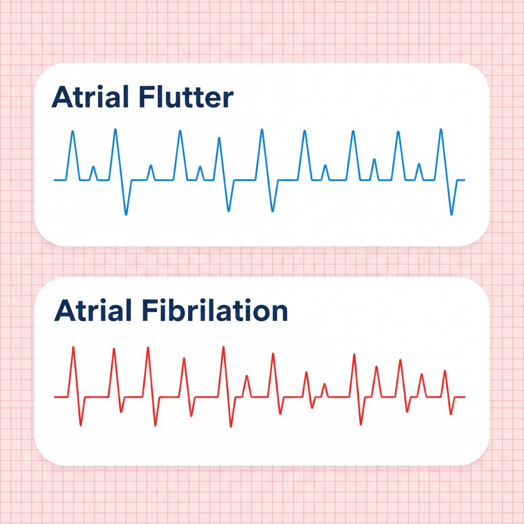
Furthermore, distinguishing “a flutter vs a fib” requires spotting specific morphological differences:
1. **Atrial Flutter:** Characterized by a “sawtooth” pattern (F-waves) between QRS complexes. It is usually rhythmic (regular).
2. **Atrial Fibrillation (A-Fib):** Characterized by an “irregularly irregular” rhythm and a chaotic, shivering baseline (f-waves) with no discernible P-waves.
If your rendering pipeline drops frames, or your smoothing algorithm is too aggressive, you might visually “erase” the sawtooth pattern of A-Flutter, making it look like a normal sinus rhythm or noise. That is a critical failure in a medical context.
Why This Happens (The Engineering Root Cause)
Why is this so hard to get right in a mobile app?
1. The Data Stream Velocity
Standard REST APIs send data in chunks. Bluetooth Low Energy (BLE) heart monitors stream raw byte arrays continuously. If you process every single packet on the main UI thread, you block the rasterizer. This results in “jank.”
2. The “Painting” Bottleneck
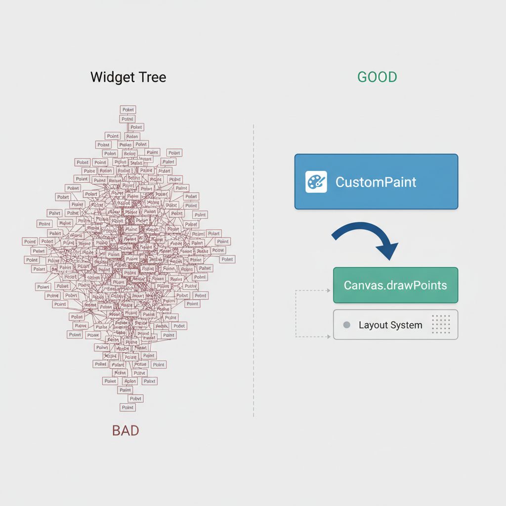
Most Flutter chart libraries operate using a widget-tree approach, where every data point might be a widget or a complex object. When you have 5 seconds of data at 500Hz, that is 2,500 objects to render. The layout pass becomes too expensive.
3. Algorithmic Complexity in Dart
To distinguish A-Flutter from A-Fib, you need to calculate the **RR-Interval** (the time between heartbeats).
* **A-Flutter:** The RR-intervals are often consistent (e.g., every 3rd sawtooth is a beat).
* **A-Fib:** The RR-intervals are completely random.
If your Dart code calculates this logic inside the `build()` method, you are doomed to performance issues.
When You Usually See This Issue
This specific challenge arises in high-stakes environments:
* **Remote Patient Monitoring (RPM) Apps:** Where patients wear patches (like Holter monitors) that sync to a mobile app.
* **Clinical Tablet Dashboards:** Used by nurses to view live telemetry from multiple beds.
* **Consumer Health Wearables:** Apps interfacing with devices like the Apple Watch or Polar straps via BLE.
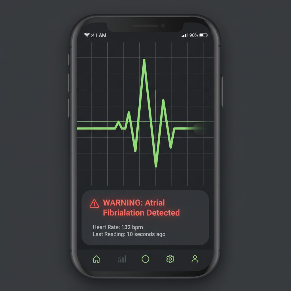
I encountered this specifically when building a triage app for emergency responders. We needed to flag “Irregular Rhythm” instantly. The default charts smoothed out the “fibrillatory waves,” making A-Fib look like simple noise. We had to rewrite the rendering engine from scratch.
Quick Fix Summary
If you are stuck and just need the architectural decision, here is the solution:
1. **Do NOT use standard chart libraries** for real-time ECG. They are too heavy.
2. **Use `CustomPainter`**: This gives you direct access to the `Canvas` API for GPU-accelerated drawing.
3. **Use a Fixed-Size Ring Buffer**: Store your raw data points in a fixed-length list to avoid memory churn.
4. **Calculate RR-Intervals on a background Isolate**: Don’t block the UI thread with math.
Step-by-Step Solution: Building the Visualizer
Let’s build a solution that can render the high-frequency data required to spot the difference between A-Flutter and A-Fib.
Step 1: The Data Structure
We need a lightweight object to hold our signal data. We also need a status enum to represent our algorithmic findings.
enum HeartRhythm {
  normal,
  atrialFlutter, // Regular irregular (Sawtooth)
  atrialFibrillation, // Irregularly irregular
  noise
}

class ECGPoint {
  final double timestamp; // X-axis
  final double voltage;   // Y-axis

  ECGPoint(this.timestamp, this.voltage);
}
Step 2: The Logic (Distinguishing the Rhythms)
This is the “Brain” of the operation. To distinguish “a flutter vs a fib,” we look at the variance in the R-to-R intervals.
* **Logic:** If the variance is high (> 0.1s standard deviation), it’s likely A-Fib. If the variance is low but the rate is high (and we detect sawtooth waves), it’s A-Flutter.
import 'dart:math';

HeartRhythm analyzeRhythm(List rrIntervals) {
  if (rrIntervals.isEmpty) return HeartRhythm.noise;

  // Calculate mean RR
  double sum = rrIntervals.reduce((a, b) => a + b);
  double mean = sum / rrIntervals.length;

  // Calculate Variance
  double variance = rrIntervals
      .map((rr) => pow(rr - mean, 2))
      .reduce((a, b) => a + b) / rrIntervals.length;

  double stdDev = sqrt(variance);

  // Heuristics (Simplified for demonstration)
  // A-Fib is characterized by "Irregularly Irregular" -> High StdDev
  if (stdDev > 0.12) {
    return HeartRhythm.atrialFibrillation;
  }

  // A-Flutter is often "Regularly Irregular" -> Low StdDev but specific rate
  // Note: Real detection requires FFT (Fast Fourier Transform) to spot F-waves
  if (mean < 0.4 && stdDev < 0.05) {
    return HeartRhythm.atrialFlutter;
  }

  return HeartRhythm.normal;
}
This logic is computationally intensive if run every millisecond. For scalable apps, consider offloading this to a background service. If you are interested in how to structure scalable services, check out our guide on scaling cross-platform app development services.
Step 3: The `CustomPainter` (The Rendering Engine)
This is where we solve the performance bottleneck. Instead of widgets, we draw paths.
import 'package:flutter/material.dart';

class ECGChartPainter extends CustomPainter {
  final List dataPoints;
  final HeartRhythm currentRhythm;

  ECGChartPainter({required this.dataPoints, required this.currentRhythm});

  @override
  void paint(Canvas canvas, Size size) {
    final paint = Paint()
      ..color = _getColorForRhythm(currentRhythm)
      ..strokeWidth = 2.0
      ..style = PaintingStyle.stroke;

    if (dataPoints.isEmpty) return;

    final path = Path();

    // Scaling logic to fit points to the canvas
    // Assumes normalized voltage between 0 and 1 for simplicity
    double xStep = size.width / dataPoints.length;

    path.moveTo(0, size.height - (dataPoints[0].voltage * size.height));

    for (int i = 1; i < dataPoints.length; i++) {
      double x = i * xStep;
      double y = size.height - (dataPoints[i].voltage * size.height);
      path.lineTo(x, y);
    }

    canvas.drawPath(path, paint);
  }

  Color _getColorForRhythm(HeartRhythm rhythm) {
    switch (rhythm) {
      case HeartRhythm.atrialFibrillation: return Colors.red; // Danger
      case HeartRhythm.atrialFlutter: return Colors.orange;   // Warning
      case HeartRhythm.normal: return Colors.green;
      default: return Colors.grey;
    }
  }

  @override
  bool shouldRepaint(covariant ECGChartPainter oldDelegate) {
    return true; // Repaint on new data
  }
}
Step 4: Managing the State
To feed this painter, you need a widget that listens to a data stream. When loading initial historical data, you might want to show a loading state. You can learn how to build a robust one in our article on building reusable loading buttons.
For the live feed, use a `StreamBuilder` or a `Ticker` to update the list of points.
Common Mistakes Developers Make
1. Over-Smoothing the Data
To make charts look “pretty,” developers often apply Bézier curves or aggressive moving average filters.
* **The Risk:** You smooth out the “sawtooth” waves of Atrial Flutter.
* **The Fix:** Use linear interpolation (straight lines) between points for medical accuracy. The “jaggedness” is clinical data, not a bug.
2. Using `setState` for Every Point
If your BLE device sends 500 packets a second, calling `setState` 500 times will kill your app.
* **The Fix:** Use a buffer. Collect points for 16ms (approx 1 frame) and update the UI once per frame.
3. Ignoring Scale
A-Fib f-waves are small. If your Y-axis auto-scales too aggressively to the R-peak (the tall spike), the baseline looks flat.
* **The Fix:** Use a fixed vertical scale (e.g., 1mV per cm) or a logarithmic scale to ensure the baseline noise is visible.
Warnings and Practical Tips
⚠️ Warning: Medical Device Regulation
If you are building this for diagnosis, your software is a “Software as a Medical Device” (SaMD). In the USA, this requires FDA 510(k) clearance. Ensure your visualization code is deterministic and tested.
💡 Tip: Saving Snapshots
Doctors often need to export these strips as PDFs or images. If you need to implement functionality to save or upload these charts, refer to our guide on production-ready Flutter image pickers to handle file permissions and gallery access.
💡 Tip: Simulator Data
You don’t need a patient to test this. You can find open-source ECG datasets (like the MIT-BIH Arrhythmia Database) to simulate “a flutter vs a fib” data streams during development.
Edge Cases and Limitations
Even with a perfect `CustomPainter`, external factors can ruin your visualization:
* Muscle Noise (EMG): If the patient moves, the baseline jumps. Your algorithm might mistake this for A-Fib. You need a bandpass filter (typically 0.5Hz to 40Hz) to clean the signal before drawing.
* Lead Disconnection: If a lead falls off, you get a “rail” signal (flat line at max voltage). Handle this exception gracefully in your `paint` method to avoid drawing lines to infinity.
What Happens If You Ignore This Problem
Ignoring the nuances of rendering “a flutter vs a fib” leads to **Clinical Ambiguity**.
If your app displays a smoothed-out line that hides the P-waves or F-waves, a physician might misinterpret the rhythm as “Sinus Tachycardia” (fast but normal heart rate) instead of Atrial Flutter. This could lead to incorrect medication dosages.
From a UX perspective, if your chart lags, users (doctors/nurses) will lose trust in the application’s real-time capabilities immediately.
FAQ Section
Can I use `fl_chart` or `syncfusion_flutter_charts` for ECG?
Yes, but with caveats. They are excellent for static reports (historical data). For real-time monitoring (streaming), they often struggle with the refresh rate required for smooth 60fps scrolling. `CustomPainter` is preferred for live streams.
How do I detect the “Sawtooth” pattern programmatically?
You typically use a frequency domain analysis (FFT). Atrial Flutter usually shows a dominant frequency in the 250-350 beats per minute range (for the atria), which appears as a peak in the frequency spectrum that isn’t present in normal rhythms.
Is Dart fast enough for real-time signal processing?
Yes. Dart’s AOT (Ahead-of-Time) compilation makes it very fast. However, for heavy math (like FFT on large arrays), you should move the calculation to a separate Isolate to prevent UI jank.
Final Takeaway & Conclusion
Distinguishing **Atrial Flutter vs Atrial Fibrillation** in a mobile app is more than just drawing lines; it’s about preserving the integrity of high-frequency medical data.
By moving away from heavy widget-based charts and embracing `CustomPainter`, you ensure your app is performant. By understanding the mathematical difference (regular sawtooth vs. irregular chaos), you ensure your app is clinically useful.
Actionable Checklist:
1. Switch your live graph to `CustomPainter`.
2. Implement a ring buffer to handle high-frequency data ingestion.
3. Add a standard deviation check to your R-R interval logic to flag A-Fib.
4. Test with noisy data to ensure your visualization doesn’t hide key details.
Building these types of tools is challenging, but it is exactly the kind of work that defines scalable, high-impact app development.
You now have the architecture to visualize the rhythm of the heart. Go build it.


