Introduction
You are likely here because you are in the trenches of building a HealthTech application, and you’ve hit a wall that sits right at the intersection of medical science and software engineering. Perhaps you are building a remote patient monitoring dashboard, a wearable companion app, or a clinical trial tool. Your product owner or the lead cardiologist just pointed at your beautiful Flutter chart and said, “I can’t tell if that’s Atrial Flutter or AFib. The waveform is too compressed,” or “The algorithm is flagging noise as an arrhythmia.”
This is a specific, high-stakes frustration. In standard app development, a “bug” means a button doesn’t click. In MedTech, a rendering artifact or a dropped data packet can obscure a diagnosis.
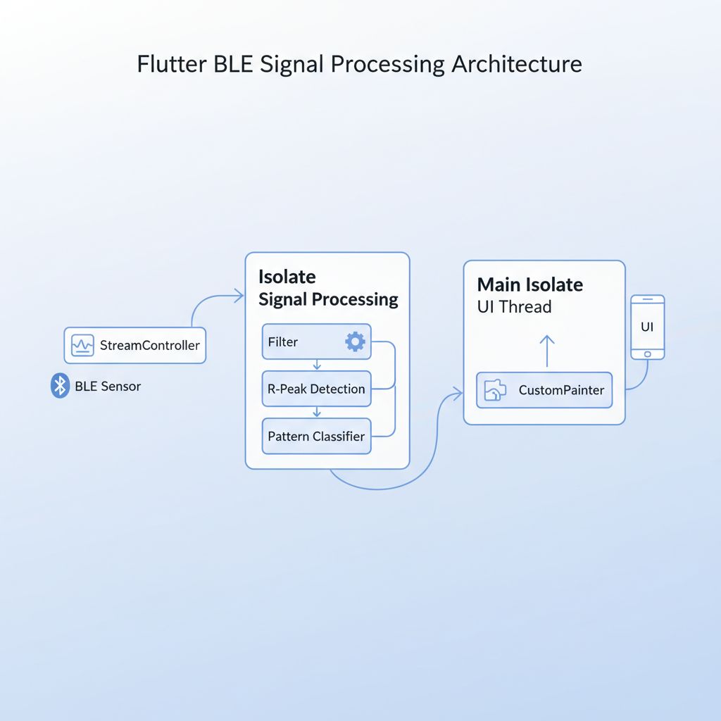
The core challenge isn’t just plotting points on a screen; it’s distinguishing between **atrial flutter vs atrial fibrillation**—two distinct cardiac arrhythmias that look superficially similar to a layout engine but mean very different things physiologically. As Flutter developers, we have to bridge the gap between raw Bluetooth Low Energy (BLE) data streams and a pixel-perfect `CustomPainter` that a doctor trusts.
In this guide, we will break down exactly how to visualize, differentiate, and detect these patterns in a Flutter environment. We will look at the signal processing logic, the rendering performance (crucial for high-frequency ECGs), and the architectural patterns that keep your UI at 60fps (or 120fps with Impeller) while crunching biosignals.
What the Problem Is: Visual Ambiguity in Signal Rendering
The problem usually manifests in two ways: **Visual Fidelity** and **Algorithmic Confusion**.
When you stream ECG (Electrocardiogram) or PPG (Photoplethysmography) data at 250Hz or 500Hz, standard charting libraries often downsample data to fit the screen width. This optimization, which works great for stock prices, is disastrous for cardiology.
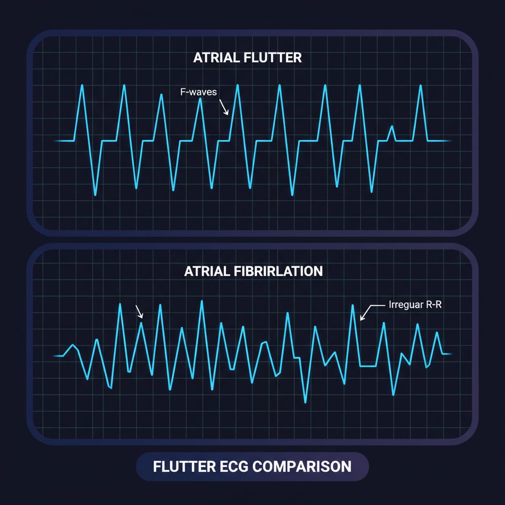
If you aggressively downsample an ECG signal, you lose the **”Sawtooth” pattern** (F-waves) characteristic of Atrial Flutter. The chart just looks like a flat line with spikes (QRS complexes). Conversely, if you don’t handle the noise floor correctly, a chaotic Atrial Fibrillation signal might look deceptively regular.
You aren’t just debugging code; you are debugging a representation of human biology.
Why This Happens (The Physiology Meets The Code)
To fix the code, you must understand the signal. The distinction between **atrial flutter vs atrial fibrillation** relies on two factors: **Regularity** and **Waveform Shape**.
1. Atrial Flutter: The Sawtooth
In Atrial Flutter, the heart’s upper chambers (atria) beat too fast but in a regular, organized circuit.
* **Rate:** 250–350 beats per minute (atrial).
* **Pattern:** Regular.
* **Visual Key:** The baseline between heartbeats isn’t flat; it looks like the teeth of a saw (F-waves).
* **Dev Challenge:** If your chart smoothing algorithm is too aggressive (e.g., cubic headers), it will “smooth out” these sharp teeth into a gentle wave, hiding the pathology.
2. Atrial Fibrillation (AFib): The Chaos
In AFib, the electrical signals are chaotic and disorganized.
* **Rate:** 350–600 beats per minute (atrial), but the ventricular response is random.
* **Pattern:** Irregularly Irregular.
* **Visual Key:** No distinct P-waves; the R-R interval (distance between spikes) varies randomly.
* **Dev Challenge:** Detecting this requires calculating the variance of R-R intervals in real-time. If your main thread is blocked by UI rendering, you might miss data packets, creating artificial “irregularity” that looks like AFib but is actually just lag.
When You Usually See This Issue
This issue rarely appears in simple fitness trackers that only show “Heart Rate: 72 BPM.” You will encounter this specific “atrial flutter vs atrial fibrillation” visualization challenge when:
* Building FDA-cleared **Class II medical devices** or companion apps.
* Developing **mHealth apps** for post-operative monitoring.
* Integrating with high-fidelity sensors (like Polar H10 or clinical patch Holter monitors) via Bluetooth Low Energy.
* Scaling your app to handle continuous data streams for 24-hour monitoring.
If you are working on early-stage prototypes for these kinds of apps, you might want to read about scalable Flutter MVPs to understand how to structure your project for medical compliance from day one.
Quick Fix Summary
If you are currently staring at a broken chart and just need the solution:
1. **Stop using general-purpose chart widgets** for high-frequency ECG. They carry too much overhead.
2. **Use `CustomPainter`** with a `Path` object for the waveform. It is the only way to get 60fps with 500+ points on screen.
3. **Move signal processing to an Isolate.** Do not calculate R-R intervals on the main thread.
4. **Disable anti-aliasing** on the `Paint` object if you are rendering thousands of points; it sharpens the line and improves performance significantly.
Step-by-Step Solution: Visualizing and Detecting the Difference
We are going to build a solution that visualizes the raw data accurately (preserving the sawtooth) and performs a basic algorithmic check to distinguish the rhythm.
Step 1: The Optimized ECG Painter
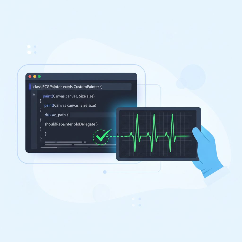
To visualize **atrial flutter vs atrial fibrillation**, we need a renderer that respects every data point. General charting libraries often use “spline” interpolation, which invents data that doesn’t exist. We want a raw linear path.
import 'package:flutter/material.dart';
import 'dart:ui' as ui;

class ECGPainter extends CustomPainter {
  final List dataPoints;
  final double scaleFactor;
  final Color traceColor;

  ECGPainter({
    required this.dataPoints,
    this.scaleFactor = 50.0, // Adjust based on signal amplitude
    this.traceColor = Colors.greenAccent,
  });

  @override
  void paint(Canvas canvas, Size size) {
    if (dataPoints.isEmpty) return;

    final paint = Paint()
      ..color = traceColor
      ..strokeWidth = 1.5
      ..style = PaintingStyle.stroke
      // 💡 TIP: Disabling anti-alias can boost performance for high-density data
      ..isAntiAlias = true;

    final path = Path();

    // Calculate horizontal step size based on canvas width and data length
    final double stepX = size.width / (dataPoints.length - 1);
    final double midY = size.height / 2;

    // Start at the first point
    path.moveTo(0, midY - (dataPoints[0] * scaleFactor));

    for (int i = 1; i < dataPoints.length; i++) {
      double x = i * stepX;
      double y = midY - (dataPoints[i] * scaleFactor);

      // Use lineTo for medical accuracy.
      // quadraticBezierTo creates smooth curves that may hide F-waves (sawtooth).
      path.lineTo(x, y);
    }

    canvas.drawPath(path, paint);
  }

  @override
  bool shouldRepaint(covariant ECGPainter oldDelegate) {
    // Only repaint if data actually changes
    return oldDelegate.dataPoints != dataPoints;
  }
}
Step 2: Detecting the Rhythm (The Logic)
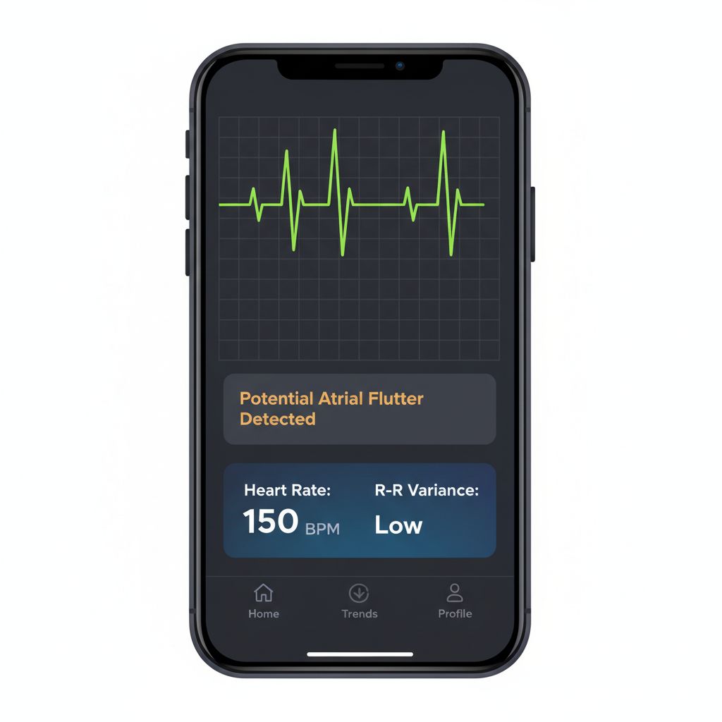
Visualizing is half the battle. Now we need to detect the pattern. The key differentiator is the **regularity of the R-R interval** (time between heartbeats).
* **Atrial Flutter:** R-R intervals are often regular (or follow a fixed ratio like 2:1 or 3:1).
* **Atrial Fibrillation:** R-R intervals are completely random.
We can use a simplified version of the Pan-Tompkins algorithm logic to detect peaks and calculate variance.
import 'dart:math';

enum RhythmType {
  normal,
  atrialFlutter, // Regular rapid
  atrialFibrillation, // Irregular rapid
  unknown
}

class RhythmAnalyzer {
  // Thresholds (simplified for demonstration)
  static const double _afibVarianceThreshold = 0.15; // High variance = AFib
  static const int _tachycardiaThreshold = 100; // BPM

  RhythmType analyzeRhythm(List rrIntervalsInSeconds) {
    if (rrIntervalsInSeconds.length < 5) return RhythmType.unknown; // 1. Calculate Average Heart Rate double avgRR = rrIntervalsInSeconds.reduce((a, b) => a + b) / rrIntervalsInSeconds.length;
    double bpm = 60 / avgRR;

    // 2. Calculate Coefficient of Variation (CV) for regularity
    // CV = Standard Deviation / Mean
    double sumSquaredDiff = rrIntervalsInSeconds.fold(0.0, (sum, val) => sum + pow(val - avgRR, 2));
    double stdDev = sqrt(sumSquaredDiff / rrIntervalsInSeconds.length);
    double cv = stdDev / avgRR;

    print("BPM: ${bpm.toStringAsFixed(1)} | CV: ${cv.toStringAsFixed(3)}");

    // 3. Classification Logic
    if (bpm > _tachycardiaThreshold) {
      if (cv > _afibVarianceThreshold) {
        // High rate + High irregularity = Likely AFib
        return RhythmType.atrialFibrillation;
      } else {
        // High rate + Low irregularity = Likely Atrial Flutter (or SVT)
        // Further analysis of F-waves (sawtooth) would happen via FFT here
        return RhythmType.atrialFlutter;
      }
    }

    return RhythmType.normal;
  }
}
Why This Works
This approach separates the *visual* concern from the *analytical* concern. The `CustomPainter` ensures the doctor sees the raw “sawtooth” if it exists, without artificial smoothing. The `RhythmAnalyzer` looks at the mathematical variance in timing.
In Atrial Flutter, the electrical circuit is looping predictably, so even though the heart is racing, the beats often land on a grid. In AFib, the chaos prevents that stability.
Common Mistakes Developers Make
1. Using `setState` for Every Data Point
If your BLE device sends data at 500Hz, calling `setState` 500 times a second will freeze your app.
* **The Fix:** Use a `StreamBuilder` combined with a buffer. Update the UI at a maximum of 60Hz (once every ~16ms). Accumulate incoming data points into a buffer and flush them to the chart in batches.
2. Ignoring the “Impeller” Advantage
Rendering complex paths on older Flutter versions (Skia) could cause jank on iOS.
* **The Fix:** Ensure you are using a modern Flutter version where the **Impeller** rendering engine is active. Impeller precompiles shaders, preventing the “first-run jank” that often occurs when a complex medical chart first loads. For more on how this tech stack scales, check out our deep dive on Flutter Impeller & AI.
3. Confusing Electrical Noise with AFib
Muscle movement (EMG) can create noise that looks like the chaotic baseline of AFib.
* **The Fix:** Implement a basic low-pass filter (e.g., Butterworth) to remove high-frequency noise (above 40Hz) before passing the data to your analyzer or painter.
Warnings and Practical Tips
⚠️ **Regulatory Warning:**
If your app claims to *diagnose* Atrial Fibrillation or Atrial Flutter, it is considered “Software as a Medical Device” (SaMD) and requires FDA (US) or MDR (EU) clearance. Always label your outputs as “For informational purposes only” or “Investigational Use” unless you have that certification.
💡 **Performance Tip:**
For long-running charts (like a Holter monitor view), do not keep adding points to a list indefinitely. The memory usage will explode. Use a “Ring Buffer” (Circular Buffer) data structure that overwrites old data once the limit (e.g., 5 seconds of data) is reached.
💡 **Visual Tip:**
Medical professionals are used to standard grid paper backgrounds. 1mm box = 0.04 seconds (horizontal) and 0.1mV (vertical). Implementing a background grid painter that matches these standards instantly adds credibility to your app.
Edge Cases and Limitations
While the code above handles the “Happy Path,” real physiology is messy.
* **Atrial Flutter with Variable Block:** Sometimes, Atrial Flutter can have a variable conduction ratio (e.g., alternating between 2:1 and 3:1). This creates an *irregular* rhythm that mimics AFib. In this case, your R-R interval logic will fail. You must rely on detecting the “Sawtooth” F-waves via Frequency Domain analysis (FFT) to catch this.
* **Pacemakers:** Artificial pacing spikes are very sharp and short. Standard sampling might miss them, or they might look like QRS complexes, confusing your heart rate calculation.
What Happens If You Ignore This Problem?
If you treat medical data like standard analytics data:
1. **Misinterpretation:** A doctor might miss a diagnosis because your chart smoothed out the critical F-waves.
2. **User Anxiety:** A patient might receive a false “AFib Detected” alarm because your algorithm couldn’t distinguish noise from arrhythmia.
3. **Regulatory Failure:** During validation testing, if your visualization doesn’t match the input signal from the simulator, your app will fail certification.
FAQ
Can I use `fl_chart` for real-time ECG?
Yes, `fl_chart` is excellent, but for extremely high-frequency real-time updates (like 500Hz raw data), a `CustomPainter` is often more performant because you strip away the animation and interaction overhead that you don’t need for a scrolling strip chart.
What is the best way to simulate AFib data for testing?
You can use the MIT-BIH Arrhythmia Database (available online) to get real CSV data of arrhythmias. Do not rely on random number generators; they do not mimic the specific chaotic nature of AFib.
Does Bluetooth latency affect detection?
It affects *real-time* feedback but not the accuracy of the data itself, provided you use the correct timestamps from the device packet, not the “time received” on the phone.
Final Takeaway
Distinguishing **atrial flutter vs atrial fibrillation** in a Flutter app is a perfect test of your engineering skills. It requires you to master the `CustomPainter` for pixel-perfect fidelity, manage streams for performance, and understand the domain logic of cardiology.
Remember:
1. **Atrial Flutter** = Sawtooth waves, usually regular.
2. **AFib** = Chaotic baseline, irregularly irregular.
3. **Code** = Use `Path.lineTo` (not curves) and analyze R-R variance.
By respecting the data and rendering it honestly, you aren’t just building an app; you’re building a tool that could save a life.
If you are ready to take this prototype to a scalable production level, ensure your foundational architecture is solid. Review our guide on Scalable Flutter MVPs to ensure your codebase can handle the rigorous demands of the HealthTech market.


