Introduction
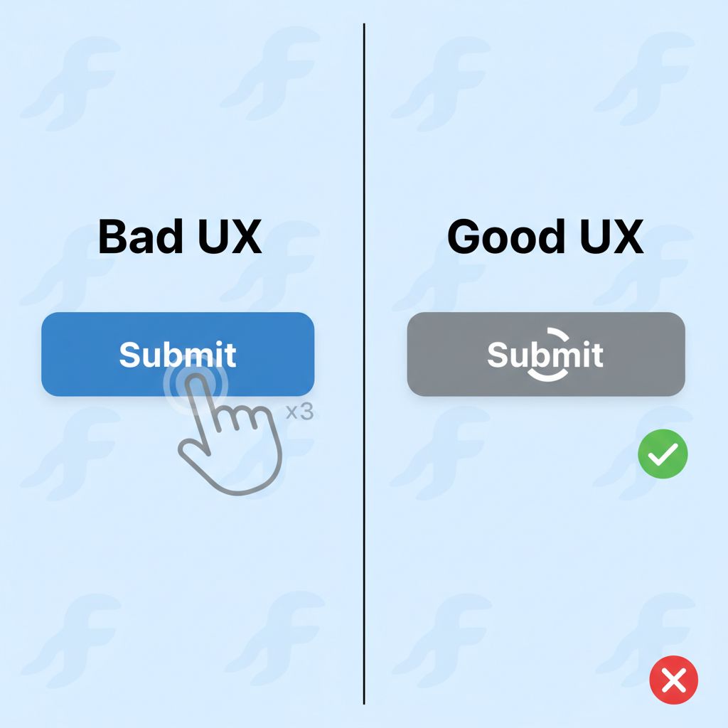
We have all been there. You are testing your app, you tap the “Save Profile” button, and… nothing happens. Or at least, it looks like nothing happened. The keyboard closes, but the screen is static. So, you tap it again. And maybe a third time.
Suddenly, the app wakes up. You end up with three duplicate database entries, three API calls, or worse—a crash because of a race condition.
This is the “phantom click” problem, and it is a user experience nightmare. In a production environment, users do not wait patiently. If the UI doesn’t respond immediately, they assume the app is broken.
As a Flutter developer, you need a robust loading button in Flutter that handles three things automatically: showing a visual indicator (spinner), disabling interaction to prevent double submissions, and resetting the state when the operation finishes.
In this guide, we aren’t just going to hack a `bool isLoading = true` into your login screen. We are going to build a production-grade, reusable `AsyncButton` widget that you can drop into any project. This is the exact type of component I use in large-scale enterprise apps to ensure data integrity and a smooth UI.
What the Problem Is
The problem isn’t just about showing a spinner; it’s about state management and user feedback loops.
When a user triggers an asynchronous action (like an API call, a file upload, or a database transaction), there is a gap between the *request* and the *response*. Without a dedicated loading state, the button remains “clickable.”
If you don’t handle this state explicitly:
1. **Duplicate Requests:** The user submits a payment form twice.
2. **UI Freezes:** Without offloading work or indicating progress, the app feels sluggish.
3. **Confusion:** The user doesn’t know if the app is working or if it ignored their input.
Why This Happens (The Event Loop)
Flutter is single-threaded. When you run a `Future`, Dart executes the synchronous parts immediately and schedules the asynchronous parts for later.
The UI (the Widget tree) is just a snapshot of your state at a given moment. If you trigger a network request but don’t tell the UI to repaint with a new “loading” appearance, the `ElevatedButton` looks exactly the same as it did before the click.
To fix this, we need to bind the button’s visual appearance directly to the lifecycle of the `Future` being executed.
When You Usually See This Issue
You will encounter the need for this pattern in almost every interactive part of your application:
* **Authentication:** Login and Sign Up screens where API latency is expected.
* **Media Uploads:** When implementing features like a Flutter Image Picker, processing and uploading images takes time.
* **Checkout Flows:** Processing credit cards (Stripe/PayPal) where double-charging is a critical failure.
* **Data Submission:** Long forms where validation happens server-side.
Quick Fix Summary
If you are in a rush and just need the logic, here is the core concept:
1. Create a custom Widget that accepts a `Future Function()` as the `onPressed` callback.
2. Inside the widget, track a local `_isLoading` state.
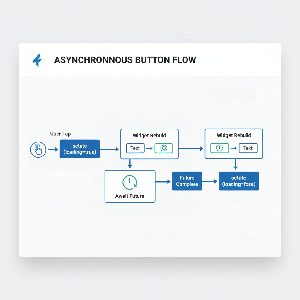
3. When pressed, set `_isLoading = true`, await the future, and then set `_isLoading = false` inside a `try/finally` block.
4. While loading, replace the button text with a `SizedBox` containing a `CircularProgressIndicator`.
Step-by-Step Solution: Building the Reusable Widget
Let’s move beyond the “quick fix” and build a component worthy of a professional codebase. We will call this `PrimaryAsyncButton`.
1. The Basic Structure
We need a `StatefulWidget` because the button needs to manage its own loading state. We don’t want the parent widget (like a Login Screen) to have to manage `bool isLoading` variables for every single button on the page. That is bad architecture.
import 'package:flutter/material.dart';

class PrimaryAsyncButton extends StatefulWidget {
  final String text;
  final Future Function()? onPressed;

  const PrimaryAsyncButton({
    Key? key,
    required this.text,
    required this.onPressed,
  }) : super(key: key);

  @override
  State createState() => _PrimaryAsyncButtonState();
}

class _PrimaryAsyncButtonState extends State {
  bool _isLoading = false;

  @override
  Widget build(BuildContext context) {
    return ElevatedButton(
      // Logic comes next...
      onPressed: widget.onPressed == null ? null : _handlePress,
      child: Text(widget.text),
    );
  }

  Future _handlePress() async {
    // Implementation details below
  }
}
2. The Async Logic (The Secret Sauce)
This is the most critical part. We need to catch errors and ensure the button stops spinning even if the API fails. We use a `try-catch-finally` block.
  Future _handlePress() async {
    if (_isLoading) return; // Prevent double clicks

    setState(() {
      _isLoading = true;
    });

    try {
      // Execute the future passed from the parent
      if (widget.onPressed != null) {
        await widget.onPressed!();
      }
    } catch (e) {
      // Ideally, handle errors here or rethrow them
      debugPrint('Error in AsyncButton: $e');
      rethrow;
    } finally {
      // CRITICAL: Check if the widget is still mounted before calling setState
      if (mounted) {
        setState(() {
          _isLoading = false;
        });
      }
    }
  }
💡 Senior Developer Tip: Always check `if (mounted)` before calling `setState` after an `await`. If the user leaves the screen while the network request is happening, calling `setState` on a disposed widget will throw an error.
3. Updating the UI for Loading State
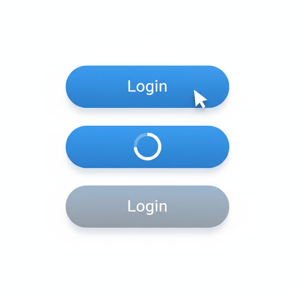
Now we modify the `build` method to swap the text for a spinner. We also want to disable the button visually while it is loading, but keep the opacity high enough that the user sees the spinner.
  @override
  Widget build(BuildContext context) {
    return ElevatedButton(
      style: ElevatedButton.styleFrom(
        // Optional: Ensure the button doesn't shrink when text is replaced by spinner
        minimumSize: const Size(150, 50),
      ),
      // If loading, we disable the button press logic,
      // but we might want to keep the color "active" depending on design.
      // Here, we just pass null to onPressed if loading to disable clicks.
      onPressed: _isLoading || widget.onPressed == null ? null : _handlePress,
      child: _isLoading
          ? const SizedBox(
              height: 20,
              width: 20,
              child: CircularProgressIndicator(
                strokeWidth: 2,
                color: Colors.white, // Match your theme
              ),
            )
          : Text(widget.text),
    );
  }
4. Using the Widget
Now, implementing this in your actual Login Screen is incredibly clean. You don’t need `setState` in your parent widget!
PrimaryAsyncButton(
  text: 'Sign In',
  onPressed: () async {
    // Simulate network delay
    await Future.delayed(const Duration(seconds: 2));

    // Perform actual login
    // await authService.login(email, password);
  },
)
This cleanliness is essential for maintaining scalable Flutter MVPs where code readability directly impacts development speed.
Advanced Approach: ValueNotifier for Performance
If you are a performance purist and want to avoid rebuilding the entire button widget (though for a button, it’s negligible), you can use a `ValueNotifier`. This is also useful if you want to trigger the loading state from *outside* the button (e.g., a validation check elsewhere).
However, for 90% of use cases, the `StatefulWidget` approach above is superior because it encapsulates the logic *inside* the button. The parent shouldn’t care about the spinner; the parent only cares that the action was triggered.
If you are dealing with complex state flows, consider looking into the ValueNotifier documentation to understand how to decouple state updates from widget rebuilding.
Common Mistakes Developers Make
Even with a custom widget, I see developers make these specific errors in code reviews:
1. Forgetting `strokeWidth` and Sizing
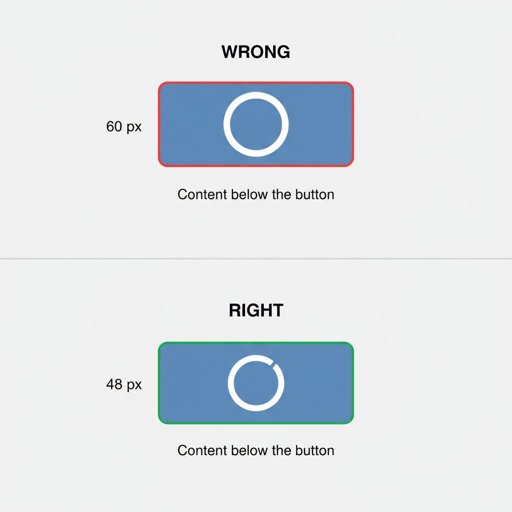
The default `CircularProgressIndicator` is too large for a standard button. If you don’t wrap it in a `SizedBox` (usually 20×20) and reduce the `strokeWidth` (to 2.0 or 3.0), it will blow up the button’s height, causing the layout to jump.
2. Swallowing Exceptions
In the `try-catch` block inside the button, if you catch the error and do nothing, the button stops spinning, but the user sees no feedback.
Fix: Either rethrow the error so the parent can show a SnackBar, or handle the error display inside the button (e.g., turn red).
3. Not Handling “Fast” Futures
If your API responds in 50ms, the spinner will flash on screen for a split second, looking like a glitch.
Fix: You can add a minimum duration logic, forcing the spinner to stay for at least 500ms, but this degrades UX speed. A better approach is often to only show the spinner if the request takes longer than 200ms.
Warnings and Practical Tips
⚠️ Warning: Context Safety
Always remember that if you are navigating to a new screen after the button press (e.g., `Navigator.push`), you must check `mounted` before using `context`.
// Inside your button's onPressed callback
await authProvider.login();
if (!context.mounted) return; // REQUIRED in newer Flutter versions
Navigator.of(context).pushReplacementNamed('/home');
💡 Tip: Accessibility
When the button turns into a spinner, screen readers might just read “Button”. Consider adding a `Semantics` widget around your spinner to announce “Loading” to visually impaired users.
💡 Tip: Theming
Do not hardcode colors like `Colors.blue`. Use `Theme.of(context).colorScheme.primary`. This ensures that when you update your app’s branding, you don’t have to hunt down every single loading button.
What Happens If You Ignore This Problem
I once consulted on a project where the “Place Order” button didn’t disable on click. During a Black Friday sale, their backend was slightly slower due to load. Users, thinking the app froze, tapped “Place Order” repeatedly.
The result?
1. Users were charged 3-4 times.
2. Inventory counts went negative.
3. Customer support was flooded.
Implementing a proper **loading button in Flutter** is not just a UI polish task; it is a critical data integrity safeguard. It is especially vital when integrating complex services, such as cross-platform app development services involving AI or heavy computation, where latency is guaranteed.
FAQ Section
How do I change the color of the spinner inside the button?
You can set the `color` property of the `CircularProgressIndicator`. However, it’s best to use `color: Theme.of(context).colorScheme.onPrimary` if it’s inside a filled button, ensuring it contrasts correctly against the button’s background.
Can I use this with Riverpod or BLoC?
Absolutely. With Riverpod or BLoC, your `onPressed` would trigger a provider method. You can either use the internal state approach (as shown in this article) for simple UI feedback, or listen to the BLoC state to drive the loading indicator if the state affects the whole screen.
How do I add an icon to the loading button?
You can use `ElevatedButton.icon` in the `build` method. When loading, you would replace both the icon and the label with the spinner, or perhaps just replace the icon with a small spinner while keeping the text “Processing…”.
Final Takeaway
Building a reusable **loading button in Flutter** is one of the highest ROI (Return on Investment) components you can create. It solves the “double-tap” bug, improves perceived performance, and cleans up your codebase by removing repetitive `setState` logic from your page widgets.
Your Checklist:
1. Copy the `PrimaryAsyncButton` code above.
2. Customize the styling to match your design system.
3. Replace every manual `ElevatedButton` that triggers an API call with your new widget.
4. Verify that it handles errors without leaving the button spinning forever.
By standardizing this interaction, you make your app feel solid, responsive, and professional. This attention to detail is what separates a prototype from a production-ready application.


